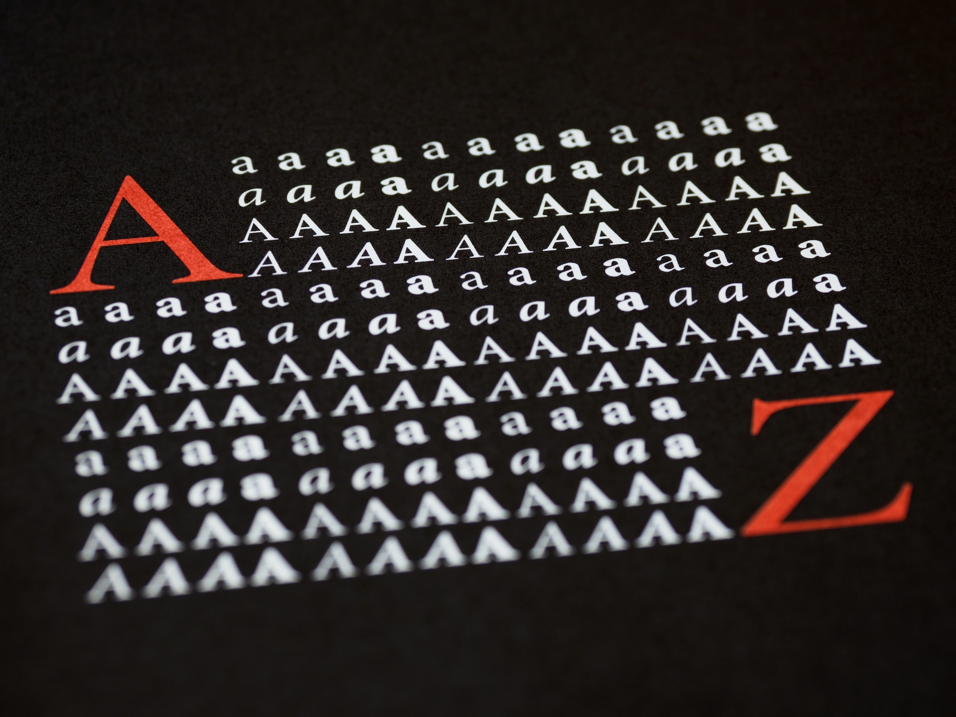
Choosing the best font is an important step in creating a good website. It creates unity in your overall design and helps your audience focus on the text. With a clean and readable typeface, the visitors to your page can get a better understanding of your brand and what you’re trying to communicate.
Sometimes, however, achieving a balance between attention-grabbing and practical can be challenging. You also have plenty of font options to choose from, making the choice trickier. Fortunately, you can hire a web design services company to guide you in making the best font choice and building a well-designed website.
That said, it’s also valuable to understand for yourself what you need to consider when selecting the typeface. So, here are four tips for effective font choice for web design:
Pick a Basic Font Type
It can get overwhelming to choose from hundreds if not thousands of different fonts. That’s why it’s a good idea to start the selection process with the basics. Choose between two of the elementary categories when defining fonts: serif or sans serif.
Serif typefaces are fonts with decorative strokes (serifs) at the ends of the vertical and horizontal lines of the letters. Some examples of serif fonts are Georgia and Times New Roman. The latter is considered a classic and default web font. It’s also very easy to read, so you won’t go wrong if you decide to use it.
On the other hand, sans serif means “without serif” in French. Simply put, you won’t see any vertical or horizontal strokes at the ends of the letters. This makes sans serif fonts appear cleaner and more modern when compared to serifs. Some of the widely used sans serif fonts are Tahoma, Verdana, Arial, and Helvetica.
Think About Your Design Purpose
The type of font you choose depends on your website’s design purpose and the type of audience you want to attract. It must also correspond with the general mood and message you want to convey to the visitors.
Picking a serif typeface is ideal if you want to have a more formal and elegant design. Serifs are also usually found in journalistic publications and within the fashion industry. If you want an approach similar to printed media on your site, find a serif font that fits your overall design.
If you want a minimalist design, sans serif fonts can be a great choice. They exude simplicity and straightforwardness; sans serif fonts are also very flexible. When used together with classic typeface, sans serifs help reflect the traditional qualities of the former. As such, you achieve a cohesive, timeless appearance.
Limit Your Choices to Two to Three Fonts
There are many beautiful fonts to choose from, so it can be tempting to use multiple typefaces in a single web design. However, instead of achieving a sleek and unified look, this design decision can make your site appear cluttered. If you prefer some variety in your website’s typeface, limit yourself to using two to three fonts.
Also, you need to decide carefully on which to use as your primary, secondary, and accent fonts. The primary font is the most visible on your page and thus reflects your brand’s identity, so make sure to choose something appealing that will match your brand. It will mostly be used for larger text, like for the headings.
Next, the secondary font is used for body copy like articles or product descriptions. Given that it will comprise a huge part of your site, the secondary font must be clean, easy to read, and won’t cause eye strain. Some fonts you can consider as your secondary font are Verdana, Roboto, and Futura.
If you want to add an accent font, consider something that’s eye-catching but won’t clash with your primary and secondary fonts. Typically, the accent or tertiary font is used to highlight certain website elements, like the navigation menu or a call-to-action prompt. That’s why they need to be prominent on the site so that your audience will see them quickly.
Assess Font Load Times
Your font choice can affect how quickly your website loads, so pick a style that won’t slow down your site. There are plenty of fonts you can find that can be rendered by browsers within seconds, so choose one of those for the best results.
When downloading your preferred fonts, include only the styles and languages you need. As a recommendation, keep it to the normal, bold, and italic styles. You should also include only the fonts in languages that you’re sure your website visitors will use. Adding more than what your website requires will add to the loading time.
When picking fonts for your website, consider the mood and message you want to convey with your design and try any or all of the tips mentioned above. This way, you pick the ones that best provide your target audience with a pleasant reading experience. The right font choice can also encourage visitors to see more of your site’s content and get to know your brand better.
References
https://qodeinteractive.com/magazine/how-to-choose-website-fonts/
https://xd.adobe.com/ideas/principles/web-design/best-modern-fonts-for-websites/
https://careerfoundry.com/en/blog/ui-design/choosing-website-fonts/


