When designing your marketable identity, otherwise known as your brand, it is absolutely important to develop a logo which will be the symbol associated with your products and/or services for the foreseeable future.
It is so important that some people spend weeks to months undecided on what design to finally use. Adobe has jumped in with their best logo maker tool online that will help sparkle some ideas. Now, even if you employ the best graphic designers available (or if you are one yourself), please try not to forget something fundamental: The name MUST be readable.
Sounds basic and overtly obvious, but most people would have a hard time admitting that sometimes in trying to come up with the most unique and ‘radical’ logo possible, readable falls to the side and they end up regretting it. But that will not be you, if only you use the following tried and true fonts to make cool and readable logos. No way they mispronounce you anymore.
#1 Borg
 [su_button url=”https://www.dafont.com/borg.font” target=”blank” style=”flat” background=”#d26a3a” size=”6″ center=”yes” radius=”0″ text_shadow=”0px 0px 0px #000000″]Get here[/su_button] [su_button url=”https://www.dafont.com/borg.font” target=”blank” style=”flat” background=”#d26a3a” size=”6″ center=”yes” radius=”0″ text_shadow=”0px 0px 0px #000000″]Get here[/su_button] |
[su_box title=”Who suggested this product?” style=”noise” radius=”0″]The Borg was recommended by Rithvik Musuku from Advancing Science Worldwide. You can find out more about Rithvik Musuku here or read their product recommendation below.[/su_box] |
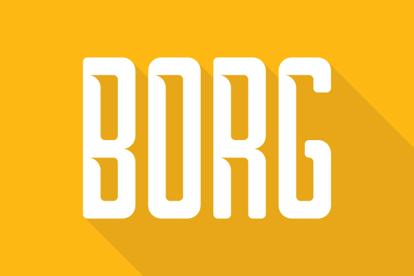
The reason I would recommend this font is that is fairly minimalistic and futuristic, while maintaining readability. Some futuristic fonts used for logos are not easily readable but I believe Borg can be used to make some simple, yet elegant logos.
Our ASW logo was made using Borg and the small details, such as the incisions in the A, give the font a unique personality. Thus, for primarily text based logos, I think Borg is an excellent font choice.
[su_button url=”https://www.dafont.com/borg.font” target=”blank” style=”flat” background=”#d26a3a” size=”6″ center=”yes” radius=”0″ text_shadow=”0px 0px 0px #000000″]Get here[/su_button]
#2 Bebas Neue
 [su_button url=”https://www.dafont.com/bebas-neue.font” target=”blank” style=”flat” background=”#d26a3a” size=”6″ center=”yes” radius=”0″ text_shadow=”0px 0px 0px #000000″]Get here[/su_button] [su_button url=”https://www.dafont.com/bebas-neue.font” target=”blank” style=”flat” background=”#d26a3a” size=”6″ center=”yes” radius=”0″ text_shadow=”0px 0px 0px #000000″]Get here[/su_button] |
[su_box title=”Who suggested this product?” style=”noise” radius=”0″]The Bebas Neue was recommended by Stacy Caprio from Stacy Caprio Inc.. You can find out more about Stacy Caprio here or read their product recommendation below.[/su_box] |
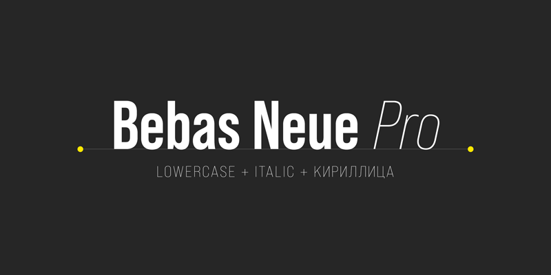
Bebas Neue is a great logo font because it is classic, simple and easy to read, all things you usually want your logo to be. It is also free to use commercially and personally, which is a great bonus if you don’t want to be paying a licensing fee for using your chosen font.
Disclaimer: I’d still recommend checking with your lawyer before using any font however.
[su_button url=”https://www.dafont.com/bebas-neue.font” target=”blank” style=”flat” background=”#d26a3a” size=”6″ center=”yes” radius=”0″ text_shadow=”0px 0px 0px #000000″]Get here[/su_button]
#3 Sans serif type fonts
 [su_button url=”https://www.dafont.com/wind-sans-serif.font” target=”blank” style=”flat” background=”#d26a3a” size=”6″ center=”yes” radius=”0″ text_shadow=”0px 0px 0px #000000″]Get here[/su_button] [su_button url=”https://www.dafont.com/wind-sans-serif.font” target=”blank” style=”flat” background=”#d26a3a” size=”6″ center=”yes” radius=”0″ text_shadow=”0px 0px 0px #000000″]Get here[/su_button] |
[su_box title=”Who suggested this product?” style=”noise” radius=”0″]The Sans serif type fonts was recommended by Dewayne Hamilton from Web Cosmo Forums. You can find out more about Dewayne Hamilton here or read their product recommendation below.[/su_box] |
Choosing the right font is a critical part of the logo design process, but it can also play a very important role in shaping an identity when it comes to defining unique features. Your best choice is one font (or a maximum of two).
More fonts may seem unobtrusive and cause potential customers to be distrustful. For all your sophisticated, professional needs, Sans serif are the most beautiful fonts. They work fantastically for corporate branding, media printing, and other typographic needs assortment. I particularly love them for their sophistication and simplicity.
[su_button url=”https://www.dafont.com/wind-sans-serif.font” target=”blank” style=”flat” background=”#d26a3a” size=”6″ center=”yes” radius=”0″ text_shadow=”0px 0px 0px #000000″]Get here[/su_button]
#4 Avenir Next
 [su_button url=”https://text.design/art-text/” target=”blank” style=”flat” background=”#d26a3a” size=”6″ center=”yes” radius=”0″ text_shadow=”0px 0px 0px #000000″]Get here[/su_button] [su_button url=”https://text.design/art-text/” target=”blank” style=”flat” background=”#d26a3a” size=”6″ center=”yes” radius=”0″ text_shadow=”0px 0px 0px #000000″]Get here[/su_button] |
[su_box title=”Who suggested this product?” style=”noise” radius=”0″]The Avenir Next was recommended by Nicco Schaal from Domain-Inventory. You can find out more about Nicco Schaal here or read their product recommendation below.[/su_box] |
Having tried many font software companies, I now only use the fonts provided by Art Text 2.
After having tried and experienced all their choices, I now only use the font Avenir Next for all my logos.
The clarity and versatility of this font, Avenir Next is unmatched, regardless of what color or size of I choose. From Ultralight to Very Fat and choice of size from tiny to huge, Avenir Next is the perfect font for my domain name logos.
[su_button url=”https://text.design/art-text/” target=”blank” style=”flat” background=”#d26a3a” size=”6″ center=”yes” radius=”0″ text_shadow=”0px 0px 0px #000000″]Get here[/su_button]
#5 Brandon Grotesque
 [su_button url=”https://www.myfonts.com/fonts/hvdfonts/brandon-grotesque/” target=”blank” style=”flat” background=”#d26a3a” size=”6″ center=”yes” radius=”0″ text_shadow=”0px 0px 0px #000000″]Get here[/su_button] [su_button url=”https://www.myfonts.com/fonts/hvdfonts/brandon-grotesque/” target=”blank” style=”flat” background=”#d26a3a” size=”6″ center=”yes” radius=”0″ text_shadow=”0px 0px 0px #000000″]Get here[/su_button] |
[su_box title=”Who suggested this product?” style=”noise” radius=”0″]The Brandon Grotesque was recommended by Tom Buckland from HQ SEO. You can find out more about Tom Buckland here or read their product recommendation below.[/su_box] |
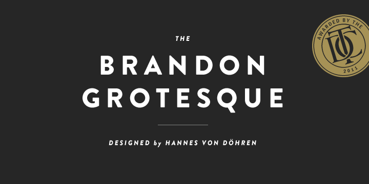
Brandon Grotesque is the font suggested.
Ironically the grotesque part of this font’s name is the antithesis to what it provides.
“Brandon Grotesque is best used for complex, professional typography. It provides wondrous results when used for contemporary looking logo design.
Brandon Text is better used as display face and logo enhancing than for body copy. Brandon Text, unlike many other fonts still looks great at large sizes – where other fonts lose their identity or qualities that help them stand out.”
[su_button url=”https://www.myfonts.com/fonts/hvdfonts/brandon-grotesque/” target=”blank” style=”flat” background=”#d26a3a” size=”6″ center=”yes” radius=”0″ text_shadow=”0px 0px 0px #000000″]Get here[/su_button]
#6 Bodoni
 [su_button url=”https://www.fontshop.com/families/bodoni-lt/buy” target=”blank” style=”flat” background=”#d26a3a” size=”6″ center=”yes” radius=”0″ text_shadow=”0px 0px 0px #000000″]Get here[/su_button] [su_button url=”https://www.fontshop.com/families/bodoni-lt/buy” target=”blank” style=”flat” background=”#d26a3a” size=”6″ center=”yes” radius=”0″ text_shadow=”0px 0px 0px #000000″]Get here[/su_button] |
[su_box title=”Who suggested this product?” style=”noise” radius=”0″]The Bodoni was recommended by Ollie Smith from ExpertSure. You can find out more about Ollie Smith here or read their product recommendation below.[/su_box] |
Bodoni font is the best on the market for creating logos and decorative text. It features a narrow underlying structure, flat serifs and offers a profound contrast between the thick and thin strokes to those using it.
This aesthetically pleasing font offers a variety of cold type and digital versions enabling the user to create a wider range of logos for variety of uses. I simply could not have successfully designed my business logos without this fantastic product!
[su_button url=”https://www.fontshop.com/families/bodoni-lt/buy” target=”blank” style=”flat” background=”#d26a3a” size=”6″ center=”yes” radius=”0″ text_shadow=”0px 0px 0px #000000″]Get here[/su_button]
[su_box title=”Who contributed to this article?” style=”noise” box_color=”#d26a3a” title_color=”#000000″ radius=”0″]
Rithvik Musuku from Advancing Science Worldwide
Stacy Caprio from Stacy Caprio Inc.
Dewayne Hamilton from Web Cosmo Forums
Nicco Schaal from Domain-Inventory
Tom Buckland from HQ SEO and GostMarketing
Ollie Smith from ExpertSure
[/su_box]

