User experience (UX) is a broad, comprehensive area in which experts and users discover new aspects every day. It’s impossible to create a single formula of delivering excellent UX to users all the time.
Still, some pointers can help an expert maximize the value of their UX solutions custom-tailored to specific users. Thus, you need to hire an expert UX/UI design agency to develop a professionally looking, winning UX design instead of doing the guesswork trying to figure out what your users need.
Here is a guide on social media UX design that can help you ace the best UX practices and maximize the usability of your resources for the target audience.
#1 – Determine the User Profile
The most important starter for a social media design is the inside-out knowledge of your target audience. You should understand who your primary users will be, who they are by age, gender, and socio-demographics. Culturally sensitive design also means that you take into account the users’ cultural background and specifics. This data will lay the basis for more precise formulation of their needs and pain points, giving you a clear design goal and direction.
#2 – Allow Commenting
It’s pretty hard to be socially active without an ability to participate in a discussion. Thus, no matter what your social media project entails, you should give your users a voice. They should have clear and usable commenting buttons and boxes, sharing their insights and impressions with each other. Once the social commenting option is on, the project obtains a real social feel and form.
#3 – Simplify the Onboarding Process
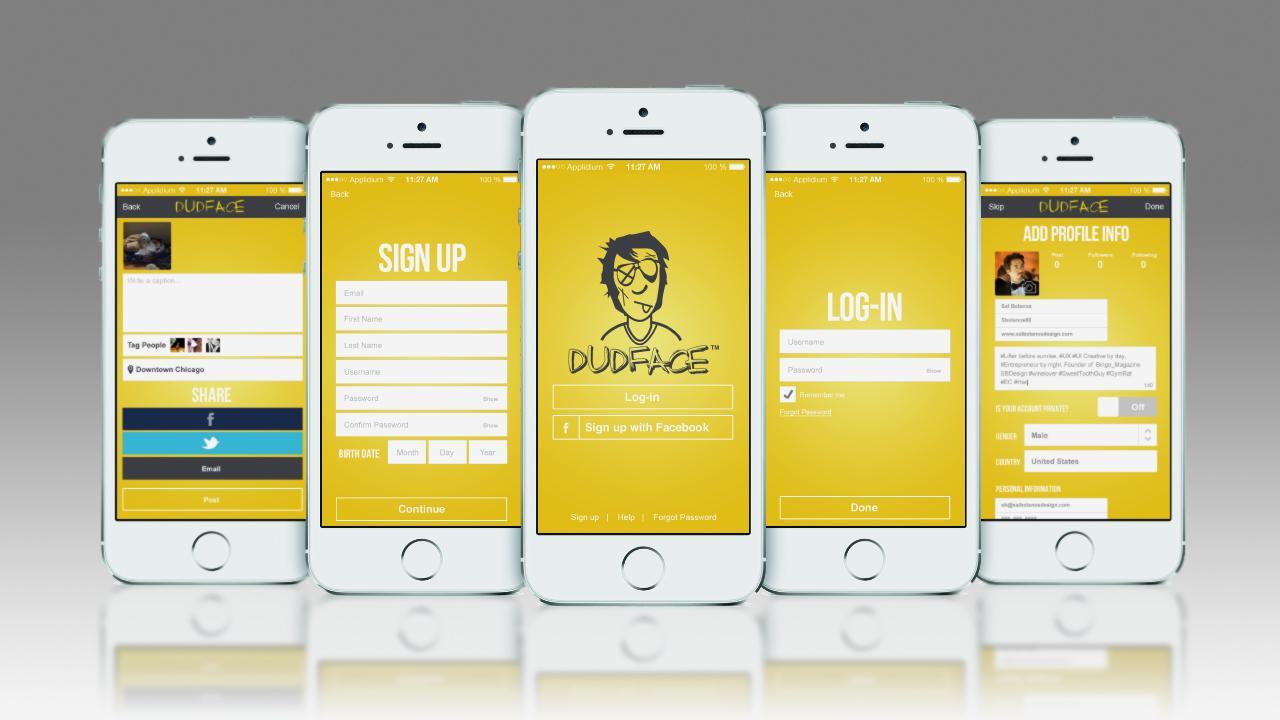
UX is mostly about usability and user-friendliness. So, onboarding is one of the crucial elements ensuring the resource’s usability and appeal. The speed and simplicity of onboarding will determine your new visitors’ first impression, giving you new clients or increasing the churn rate. Thus, your task is to let everyone in as quickly and simply as possible. Let people register a new profile with just a few clicks and a few tabs to complete. Once this is done, you can ask them for further details and data inside the social media’s profile.
#4 – Refuse from Floating Pads
Floating pads are the killers of usability in all types of web products, including social media. This visual element is ever-present on the app’s screen wherever the user scrolls, hindering the content’s visibility and impairing some vital interactions with the UI. Thus, it’s better to refuse from floating pads overall, even though their effect on sales and subscriptions once proved positive.
#5 – Boost Engagement with a Forum
Again, social media are about communication. Thus, you will boost your users’ UX if you give them handy, diverse instruments for socializing with each other. One of such effective tools is a forum; it has always been a social medium for people’s meetings and interest groupings. You can enhance the social engagement and activity of your users by allowing both registered and non-registered individuals to participate.

#6 – Listen to Users
There’s nothing better for successful UX design that listening to what your users need and delivering those solutions to them. The gravest mistake businesses commit is focusing on what they think is best for people. However, the truth is that a business owner, designer, and developer can never know for sure what people need and want unless they go out and ask people questions.
Thus, we recommend conducting thorough UX research before stopping on any design solution. The modern users are picky, so they choose only resources that respond to their expectations and preferences. By listening to users and tailoring your visual design and functionality to user wishes, you can achieve much quicker product adoption and greater customer loyalty in the digital market.
#7 – Mind the Short Attention Spans
Users are distracted by zillions of data sources today, so it gets harder to keep them focused. In most cases, you will have only a couple of seconds to capture your prospect’s attention and win a new user or customer. Thus, UX designers should keep this peculiarity in mind by designing specifically for short attention spans.
This goal can be met with simple, minimalist designs, large fonts, and presentation of only key information on the first screen of your app or website. Make sure that your visual design is consistent with the business specifics, thus making your brand memorable. This approach is called functional minimalism; it helps achieve business goals with minimum time and effort.
#8 – Be Flexible
It’s no use sticking to the initial UX design solution if you see that something doesn’t work right. Design should be flexible and responsive to testing. Thus, if you notice that some agreed elements don’t match the usability principles or cause user problems, it’s time for a new design iteration. Work on your mistakes, correct the design, and come back with a new solution to keep customers.
#9 – Don’t Skip Prototyping
Some businesses neglect the prototyping step for the sake of saving time and money. However, it’s a critical stage of UX design that can give you valuable practical insights into your design’s efficiency. There is always a chance that you’ve misinterpreted the user data and focused on the wrong needs, and prototype testing will uncover these deviations. Thus, it is a cost-effective way to correct design mistakes before the full-scale web product development starts.
#10 – Simplicity Always Wins
If you’re not sure about some visual elements or menu options, skip them. The best variant in social media UX design is minimalism and elegance, which is achieved by bringing the visual load to a minimum. Your users will thank you if the UX design sticks only to a mandatory set of handy tools without extra buzz.
UX Is More Than Your Interface
The final piece of advice is not to confuse your UX design with UI. The user interface is certainly a significant UX aspect, as users favor minimalist, functional interfaces causing no confusion and friction. Still, UX is much broader than UI design, and you should take all its elements into account to arrive at truly functional, user-friendly solutions.


