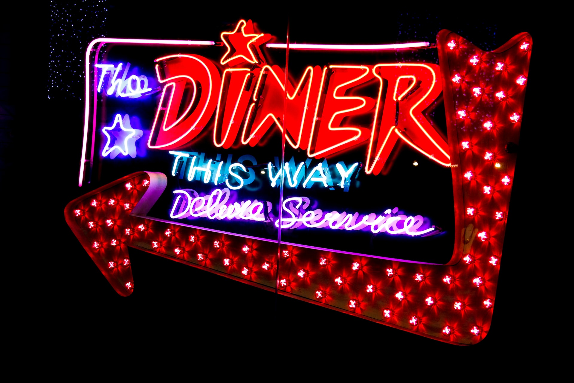
Although consumers are more digitally-driven than ever, you cannot overlook the value of outdoor signage when it comes to visibility. Retail signage has an extensive reach because countless people can see a single element. Moreover, the investment has a longer lifetime value than other marketing materials. While everything about outdoor signage sounds great, you cannot achieve much with ordinary signs. The only way to win the promotion game is by making them creative and compelling. Although there isn’t a silver bullet to achieve the goal, you can follow these unspoken rules to stay ahead of the curve..
Rule #1: Less is more
A minimalist approach is a way to go when it comes to messaging on outdoor signs. After all, you cannot bombard the audience with information because it does more harm than good. You must provide it subtly and include only things they actually need to move down the buying funnel in the long run. Besides practicing restraint with the volume of text, keep the visuals simple yet stunning.
Rule #2: Steer clear of clutter
Another unspoken rule to set your outdoor signage apart is to steer clear of clutter. Besides minimizing the information, ensure placing it appropriately. Use the available space frugally with an optimal balance of text and images. Studies indicate that 30-40 percent should be white space to e get attention toward the focal point. Clutter does just the opposite, making the entire sign a mess.
Rule #3: Maximize visibility
You may have the best-looking outdoor signage to promote your brand and products, but everything boils down to visibility. The location of the sign matters the most because you cannot expect the audience to work hard to spot it. With outdoor digital signage, ensure it is sun-safe so that the passers-by can see and read it throughout the day. Reflective panels ensure that the amount of light does not affect the readability of text. They also save power usage, lowering the overall costs of the project.
Rule #4: Choose readable fonts
The basic rule to ensure readability is to choose readable fonts for your outdoor advertising signs. Choosing the correct font can make all the difference to your marketing investment as the viewers can read and absorb the text, even from a distance. Conversely, the wrong ones can render them useless, no matter how hard you work on the creative design. They can easily fade into the background and hinder visibility.
Rule #5: Pick colors mindfully
Like fonts, the colors you use on your outdoor signage can make or break your outdoor displays. Ideally, stick with the brand colors because buyers connect with them sooner than later. If you want to mix other shades, pick ones that blend well with the theme colors and get attention for the banner. Pairing a dark background with lighter shades of letters is a good idea. Also, follow the trends when it comes to color choice.
Following these simple rules can help you achieve your promotional goals with outdoor advertising. You can achieve more with less by simply sticking to these basics and going the extra mile with creativity.


