Unless your office is full of creative speakers, all of which know how to make engaging presentations, chances are most of them are dull – and not at all productive. Even if most of them are not well-created or shared with the audience, a lot of the information in a business is shared via presentations.
There are many types of business presentations. Whether you use them to share your findings with the team, show them the future plans for your business, or you use presentations to impress investors and clients – you need them to be great to be successful.
What makes a great presentation, you might ask?
A lot of a presentation’s success depends on its design.
Why Is Presentation Design Important?
A person can be a great speaker, their images might be the perfect representation for the topic and yet, the presentation can be a failure. Presentations need to look good, be well-structured, and engaging for those who see them.
This is a visual aid for the speaker, but also the listeners. Luckily, you don’t have to do this professionally to create successful business presentations. It takes a bit of experience and practice, some creativity, and perhaps a bit of help to make presentations that achieve their intended purpose.
If you want to reach your goals with the presentations you make, you should definitely consider the tips below.
1. If your approach doesn’t work, get help
Business presentations are not like those projects you had at school. You’re not aiming to get a higher grade or impress your teacher. These projects can determine a lot for your success and that of the business. Distracted potential clients or investors can lose interest in picking your company. Employees that aren’t engaged by it can miss its purpose and message, and do their job poorly as a result.

These presentations are too important for you to experiment with. The more important the presentation, the harder it is to make. If you haven’t done many before, or if your past presentations haven’t yielded great results, it might be better to invest in some help.
Yes, there are plenty of tips and tricks you can find online, some of which you’ll read in this article, that can help you improve your skills. Pitch’s presentation design guide, for example, offers amazing tricks for improving the design of your presentation.
What they also offer you is assistance. From project plans to pitch decks and conference keynotes, Pitch is an amazing presentation software. This is not your ordinary template page where you can download a silly template, fill it out, and make it as generic and unattractive as it can be. It’s a place where you’ll get a professional, custom-made presentation that will boost your chances of success.
2. Make it more readable
Did you decide to do it on your own? Then one of the main concerns you have is readability. Design won’t work unless your content is visible and readable to the audience.
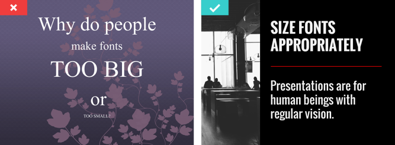
Just take a moment to remember those slides that were so packed with content, it was impossible to read it all. The font was too small or too big, the background colors made it illegible, so you didn’t even bother to read it.
Many presentations are made this way. The creators are so focused on finding a great background and placing the right kind of content that they don’t stop to consider whether everyone will be able to see it from afar.
There are several things you should be considering when making your design readable:
White space is a necessity
The only way to make content less cramped is by adding enough white space around it. This is also a great way to emphasize it. It’s not something you should decide on, but it’s something that should be your priority.
Be short and clear
Huge blocks of text or, even worse, entire lengthy sentences do not belong in a great presentation. It’s recommended not to write entire paragraphs in the slides but if you decide to do so, limit it to 10 or 12 words per line.
Use proper height for the lines
Even if you use a bit of content and make the perfect choice for words, placing it too tightly on the screen can make it harder to read. It also makes it look like there’s a lot of content on the screen. Your slides will probably share some information and, unless you are there to guide them through it all, this is your only form of nonverbal communication. It’s your job to make it look more attractive and easier to read.
Readable color and font choices
The font type you choose, its size, its color, how it fits with the background, whether or not it is readable from all angles – this is all highly important to consider. Your audience should be able to read it all without squinting or changing seats.
3. Make a wise choice of fonts
Fonts are too important for your design, so let’s focus on them a bit more. Here are some tips to consider when you’re creating your presentation:
- Pick the right font size. Most agree that the presentation font should at least be 30pt in size. This makes it readable from afar. Another great thing about font size is that you can use it to emphasize the key information. Don’t be afraid to mix it up. Make sure it is all legible, but use an even bigger font to point out the key information.

- Don’t over-style it. There are plenty of things that can help you push the audience in the desired direction, point out the key information, entice them to look, etc. However, overdoing it is not a good idea. Yes, you should use a change in color now and then, as well as italics or bold to make your point. The human eye is drawn to the things that stand out. But, if too many things stand out, the presentation will simply be distracting.
- Choose a complimentary color based on your background and visuals. If you put a light font on a light background, people won’t be able to see it. If you make the background too colorful, your font might be illegible in some places. Pay special attention to your font color choices, and make them fit into the rest of the design.
- Pick the right type of font. We are often tempted to pick less often used fonts because they look more unique and are interesting. However, what many fail to consider is that not all devices are the same, so your font might not be available to the audience after all. The general, often-used types of fonts like Calibri, Cambria, and Arial are most accepted by the audience – and devices.
4. Try to stay away from complete sentences
Have you noticed that some presenters have notes in addition to the presentation? They have these to remind themselves what they are supposed to say without overcrowding the slides. This is a perfect example that shows you what presentations are really about.
They aren’t about sharing all the information with the audience, not if you are there as the speaker. They are yours and their visual aid, but nothing more than that. It is the speaker who delivers most of the information, while the slides help share the message.
This is why images are so successful – visuals share the message, while the speaker elaborates on it.

If you put whole sentences on the presentation, chances are your audience will spend their time trying to read it all instead of listening to you. If you do this, you can’t emphasize the key information, and your slides will have lost their purpose.
There are plenty of “rules” in terms of how many words belong on the slide or what structure you should have. Some stand by them strongly, while others avoid them entirely. You can choose not to follow any of them, but still, your goal should be to make the content as limited and clear as possible.
5. Choose simple colors
If you make your slides’ backgrounds too colorful, how will you make the content readable? This will be distracting on its own, not to mention that your visuals and text won’t be as visible as they should be.

Also, mixing too many colors in a presentation is distracting. Text that is too bright causes eye fatigue, text that is too dark is tiring. Ideally, you should use darker text on a lighter background or vice versa. This allows for better visibility and makes your design more appealing to the eye.
Wrapping up
Presentations have a huge part in how people do business. They are used to share information, train employees, present the rules, and impress clients and investors. There are many kinds of presentations that you might be asked to create for your business. The good thing about this is, if you know some general rules on what to do and what not to do, your presentations can be more appealing and successful. And, of course, if your approach doesn’t work, you can always get help with this.


