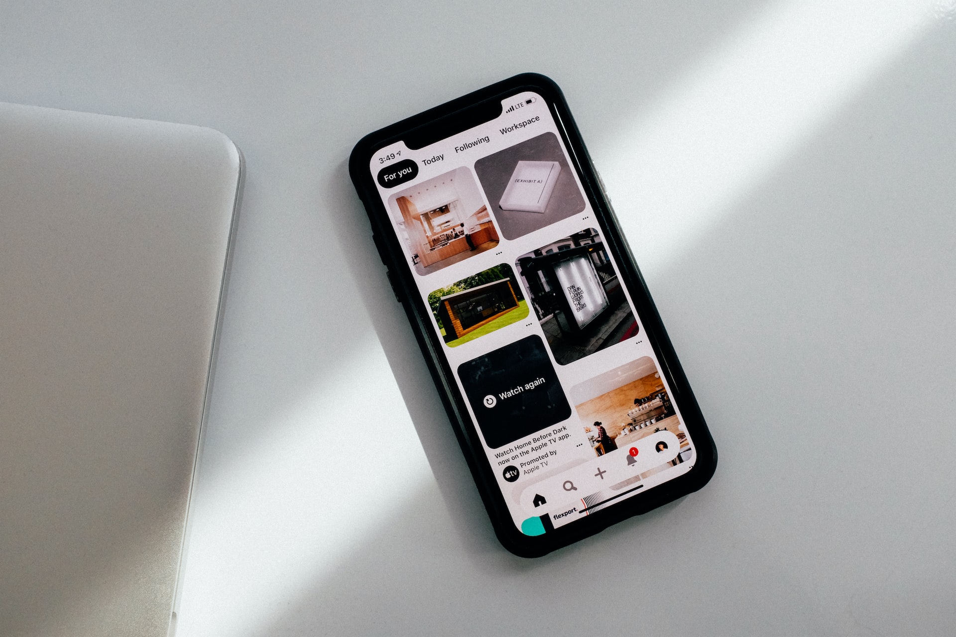
The interface is a kind of link between the website and the user. Thanks to him, the visitor can “tell” the system what he expects from it, and get a response. But what if this understanding between the user and the site did not take place? The user will simply leave in search of a more convenient resource. To prevent this from happening, you need to know about the basic principles of an intuitive interface. In this article, we will consider how an app development partner can help you to create a great interface.
What is a good interface?
As with any design process, the key to good user interface design is thinking carefully about what you want to achieve. It’s often easier to describe the kind of website or application you want to build than it is to formulate a set of rules to achieve the goal.
In fact, defining a good interface is relatively simple. Here are some of the characteristics to keep in mind:
- A good interface gives pleasure to users and enables them to quickly and easily perform the necessary tasks.
- It takes into account the diverse needs of each user – in other words, is affordable.
- It is simple and aesthetically pleasing, it is not overloaded or distracting. Users should be able to easily understand how to perform a given task.
- The focus is on your product or service, and the design acts as a bridge for customers to access it.
- It allows people to navigate and interact on their own, but at the same time, is ready to offer help if necessary.
When you combine all these elements, you end up with a simple yet powerful UI design that allows users to quickly get to what they want without having to scroll through multiple pages looking for the information they need.
To create a high-quality interface, you should understand what properties the company and the user need. Let’s consider what a good interface should look like.
Instant value
If you want new users to come back to your app, you need to make sure they get some value – preferably right away, the first time they use it. If you don’t convince the user of the value of your app, you will lose them forever. With millions of apps saturating the market and all of them vying for user attention, it’s important to make sure you’re offering the person immediate value.
Easy navigation
One of the main problems that users face when using mobile apps is poor navigation. When a user first downloads your app, they need to be clear about what to do and where to click to achieve their goal, whether it’s booking tickets, buying groceries, or searching for information. Navigation should be clear to the user so that he does not get lost on a random page.
Buttons with clear labels
Do not use buttons with icons in your app, which can have a double meaning and confuse users. However, you should not use too original icons, as they can mislead the user as well. For example, the image of a question mark is immediately associated with some kind of hint, a guide to action, and the magnifying glass icon is associated with a search on the site.
Clear, uncluttered design
The desire to fill the application with a large number of sections, buttons, navigation elements, and all that can turn into trouble. Excessive use of different elements makes it difficult for the user to understand the product. Use in the application only those elements without which the user will really not understand the interface and exclude those elements which do not carry any semantic load.
To create a high-quality interface, you should understand what properties the company and the user need.
Clear and concise content
Many mobile app developers are looking to simplify content. However, it should be remembered that the application must have enough content that the user needs to achieve the goal. Consumers still need complete information to make a purchase: delivery terms, payment method, etc. Leaving out basic information will result in a lower conversion rate. Balance is the main condition. Provide existing content and information in a clear, concise manner to make it as easy to use as possible.
Minimize the number of steps
The fewer steps, pages, buttons, and data entry fields, the better. Every time your user needs to perform an action, check to see if there is a way to simplify it and make it feel more natural. The fewer steps, the easier it will be for your users to achieve their goals. For example, autocomplete form fields with payment information, delivery address, etc. will allow users to save time.
Reduce scrolling
Users should get most – if not all – information from a single screen. Sometimes vertical scrolling is unavoidable, but try to avoid it whenever possible.
Landscape orientation
When developing a mobile application, many developers do not consider landscape orientation necessary. A good mobile app should be designed for both portrait and landscape orientations. This will provide convenience to the maximum number of users. This step is especially relevant for applications that contain video content.
Possibility of personalization
This implies the ability of the user to customize some of the features of the application for themselves. For example, a person can change the font color and size, background, block layout, etc. There are usually options to choose from.
Custom language
Each text block should be intended for the target audience, and be extremely clear. That is, if you need to create an application for school children, there will be simple colloquial vocabulary, sometimes even with slang words, and the programmer’s resource will be full of professional and complex terms. All this must be taken into account in order for the audience to be imbued with the product.
Unobtrusive prompts
Using hints is a great idea. They allow the user to understand exactly what he could not figure out on his own. To keep these hints unobtrusive and working, remember these rules:
- there should be a minimum of text;
- you should not make pop-up lines for each element of the application (only where you really cannot do without them);
- add a function to temporarily or completely disable help.
Summary
The success of a mobile application depends on how convenient it is to use, and how users perceive it. Usability is what will help turn users into loyal customers and lead to increased revenue. Perpetio is a reliable company with a team of experienced designers and developers who know how to create an effective mobile application interface and bring an effective product to the market.


