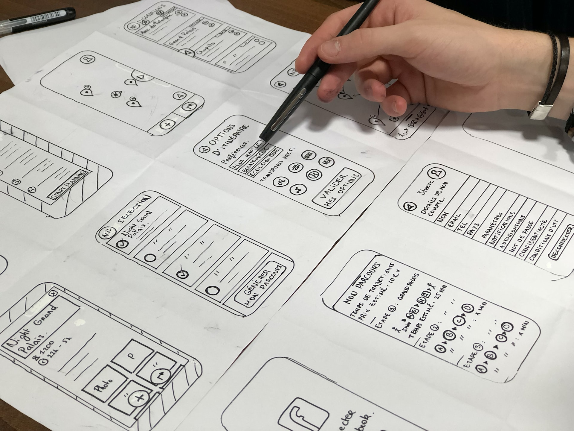
You may have probably noticed that designers often picture the launch of a project in the form of an airplane. If to proceed with a comparison, an airplane is like a website while its UX/UI design is all the levers and buttons used for its functioning. This is their fundamental difference.
Imagine a person far from aviation in the cockpit of a flying machine. Will they be able to understand at first glance how to rise into the air and fly? If they immediately see simple, clear instructions, and if the dashboard is intuitive – they will be able to take off successfully. This is the main purpose of UX/UI services by Otakoyi – to help the user quickly navigate and achieve the goal.
The world is gradually producing everything that makes life easier for us. Therefore, today’s slogan of the designer and developer is ー “Let’s make it work easier and simpler!”
So let’s see how everything can be simplified and improved so that users can sit down, press a button and start a journey.
1. Functional minimalism
Applications should not tire users with unnecessary actions and distract them from the main goal.
The principle of functional minimalism means “nothing superfluous.” This applies to everything – content, number of actions, design elements, etc. If a website can afford rich content and a catchy design, it is fatal for an application. Here we have limited visual space, and it should be used sparingly and only for the most important elements. However, nothing extra does not mean boredom, primitiveness, or monotony.
2. Sequence, order, and predictability
Order is the organized presence of the most necessary things on the screen. This is a clear hierarchy of content, a logical sequence of what each button, section, and page leads to.
The less the user thinks about what to do, the better. The interface itself should conduct it. This means a simple and easy path on which there is nothing redundant. Not all people are as observant as designers, and you shouldn’t make them look for what they need or wonder where everything is. As we have already mentioned, they are not the “pilots!”
Navigation should be consistent and clear. If the user gets lost in the screens, this is a huge flaw of your app. Therefore, you should not hide navigation elements or move them while navigating. If necessary, you can use visual clues to give a hint to the end users.
3. Clearly define the action button
Also known as a CTA (call to action), this button ensures that the user can figure out where the primary function is enabled, and the general purpose is served.
Here are a few things to consider when defining an action button. First, it must clearly define the action. It has to be something that will distinctly explain the purpose.
Secondly, the action button should be easily visible and accessible. It is difficult for right-handed people to reach the upper left corner of the mobile device screen without using both hands. At the same time, it is vice versa for left-handed users. Hold your mobile phone in your hand and pay attention to the area of the screen that your thumbs can easily reach. This can be the area to place your action button.
4. Number of items per page
There can be an infinite number of items, but it is customary to show them in a limited amount per page, with the ability to expand the feed or go to the next one. Listing less than 15 positions is a bad SEO idea. It is better to combine small categories into one larger one and add filters.
As tests show, half-empty listings discourage users, and if you have a small assortment (especially when it comes to eCommerce), in principle, you should try different ways to improve UX. For example, although it is most convenient to view listings with four products on the screen from a smartphone, you can also leave one, having first thought through such an interface. Also, if the product is available in different configurations, colors, materials, etc., you should make a separate card for each of them.
5. The proper structure is the key to success
All content should be alike as possible. This applies to the uniformity of the interface – all buttons, blocks, active elements on each page, and many other things. Customers like it when their expectations are met.
In the case of jewelry, for example, three photos are enough – just jewelry, one with essential characteristics, for example, length, and a photo of the model. For clothes, several pictures are added, in which you can consider the product from different angles, and for equipment – again, important elements. In general, everything has its own rules, which are known to your photographers and designers. You just need to listen to them. Also, if the white background seems boring to you and, for example, does not fit the brand concept, stick to the chosen style in each photo.
6. Do your research!
In order to understand precisely what needs to be developed, fixed, removed, or added, large-scale analytics are carried out, which include user surveys, market research, business analysis, the study of session recordings, and much more. All the data received is later implemented into a feasible solution. UX and UI design processes go hand-in-hand with research.
Conclusions
Improving usability is a never-ending process that should begin with implementing the recommendations listed in this article. The proper UX and UI design determine how convenient and understandable the application is for users. Working on improvements of these characteristics will increase the conversion rates from just users to buyers. In addition, the better the usability, the higher your pages will be in search results. This, for sure, simplifies work for your marketing and SEO specialists, that can optimize your app to its fullest potential.
We hope these tips help you improve the UX and UI of your app and increase user retention rates.

