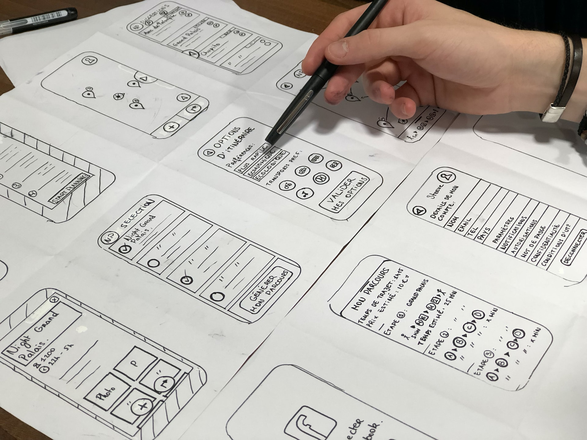
The landscape of apps is more competitive than ever before, and it’s only growing more so. High levels of competition can drive developers to increase the complexity of their systems, and while this can give them an edge, it can also drive users away. Instead, the best modern UX design often comes from starting as simple as possible and using that as a launch pad on top of which everything else can be built. Functionality like this isn’t easy, but with the right approach, it’s often the most appreciated.
Simple Done Right
Some of the best illustrations of how well simplicity works as a foundation can be found in online casino titles, like Betfair online slots. Titles on this service like Fishin’ Frenzy and Buffalo Blitz come with varied bonus systems, but their UX is kept very simple. This applies no matter what system is played on, with mobile and desktop both functioning identically. Finally, even the website itself is kept simple, despite offering an enormous range of different games from which to choose. With this in mind, the UX could be expanded from this slot example into direct simplicity, conversion simplicity, and broader simplicity.
Direct UX Simplicity
The first appearance counts in software, especially if you’re creating an app for a broad audience. Too many features, or features which are poorly labeled, are only going to alienate and confuse users, so clarity is key. In slot games, this is accomplished by cutting down the number of buttons on the game to a minimum. Most titles include spins, options, ways to modify bets, and not much more. Despite complex systems running in the background, slots have always been about simple appearances, and as Britannica explains, players appreciate this.
Leveraging Simplicity for Other Platforms
Computers are the workhorses for many systems, but plenty of users prefer to use mobiles whenever possible. According to Data Reportal, mobiles now account for around 60% of the world’s web traffic, and it’s how users spend more than 56.9 percent of their online time. Proportions like these dictate that, if possible, any app designed for PC first should be made with mobile functionality in mind. Slots manage this by keeping their design basic and consistent no matter the platform. If users are familiar with one form of access, they’ll be immediately comfortable and familiar with another, helping ease even technologically intimidated users.
Streamlining the Bigger Picture
An app being simple shouldn’t just apply to the app itself, it also needs to work with the framework surrounding the app. Online casinos face this issue because of the wide range of titles they offer, often delivering slots in the hundreds. UX design here means keeping each game offering as easy to read and navigate as possible. Showing off the number of games on display is important, but not at the cost of overwhelming new players.
No matter the stage of development an app in is, UX design needs to be at the forefront of creatives’ minds. Failing to keep with this idea will drive away new potential users, and can frustrate existing ones. Though it’s always important to offer flexibility for power users, what’s seen up front needs to be something that everyone can appreciate, no matter their technical or industry expertise. Keep this in mind, and you’ll have a much stronger foundation on which to build.


