To attract the attention of users and keep them on the site, web designers constantly analyze the tastes and needs of the audience, trying to improve the interface and the visual design. In the e-commerce field, visualization plays an important role. According to research, the web page design affects its financial performance and leads to better conversion. Those online stores with top-level designs that meet modern requirements and trends have 32% more profit than their competitors.
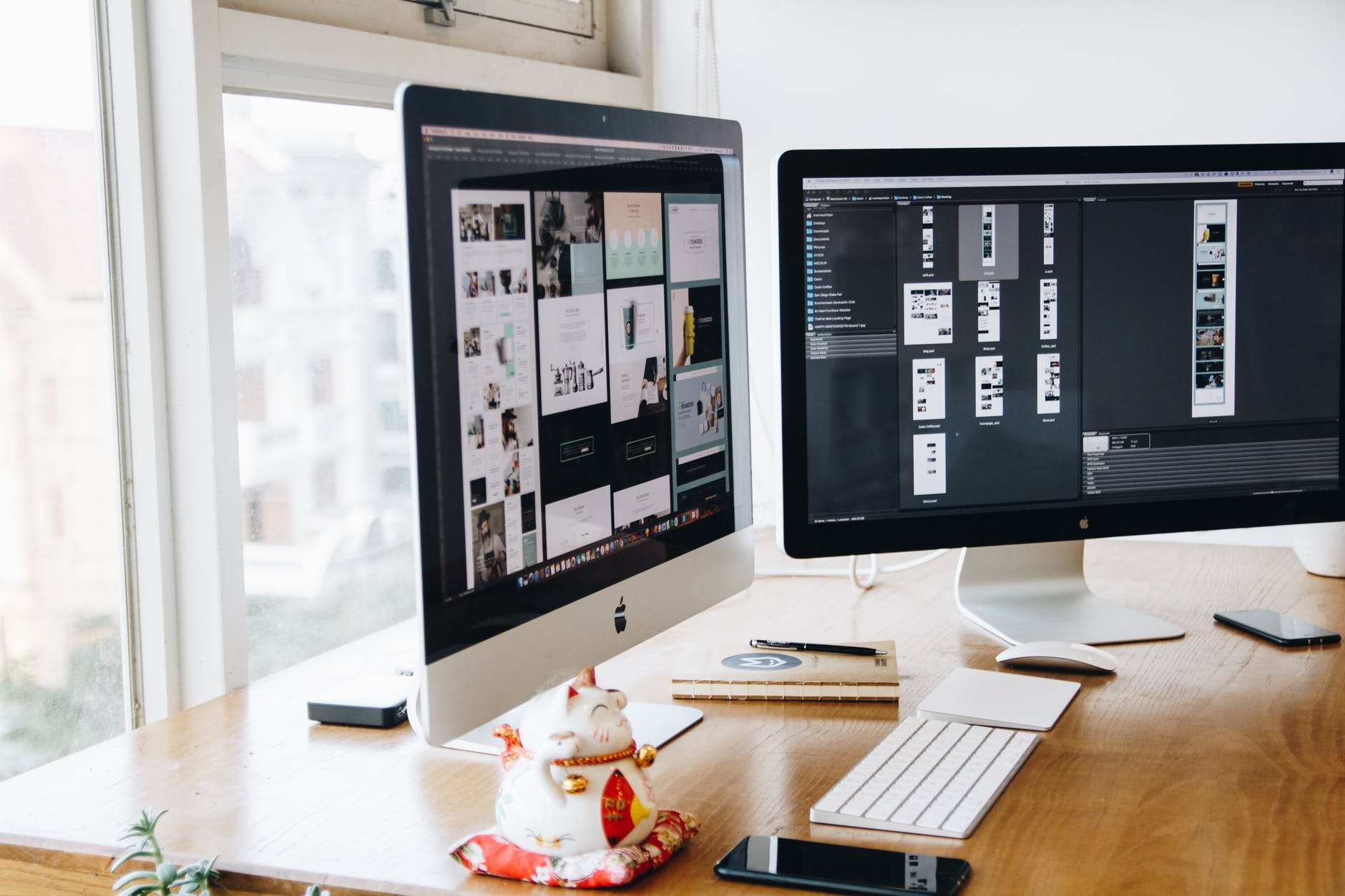
The importance of web design in e-commerce
The process of developing and designing a site involves working on the layout, color, graphics, interface, fonts, content, style, and structure. Web design in the field of e-commerce has several tasks, it:
- improves the interaction with visitors;
- broadcasts brand values;
- creates a link between business and customers;
- allows standing out from the competitors.
The quality of customer service is also one of the most important criteria used in evaluating commercial activities related to the sale of goods and services via the Internet. A site can be trendy and unusual, but at the same time bring almost no sales. The design and usability of the resource are what the visitor pays attention to first. These two indicators determine whether the user will stay on the site and whether they will return to the page. Take your time and read more about the importance of web design here.
Why is the design of an online store so important from a business point of view? Everything is very simple. If the client experiences difficulties when scrolling through pages, if something distracts them from completing the target action, for instance, making a purchase, then sales figures will never be high until the situation is corrected.
Moreover, an inconvenient interface and a primitive design can cause failures when the buyer reaches the shopping cart, but the order has not been placed. In this case, there is a risk of losing existing customers who have made a purchase, but are not satisfied with the site and do not trust the brand. Thus, there is a clear connection between the web design of an online store and the success of the brand.
Web design trends in 2022
Of course, in different countries and cultures, certain traditions have long been formed, which in one way or another affect both the preferences of buyers and design in the field of e-commerce. For example, the Swedes respect the minimalistic Scandinavian style, while in the UK, they honor elements of the English school of design. But there are also global trends that set the vector of development for large companies and affect the style of business sites:
Dark theme
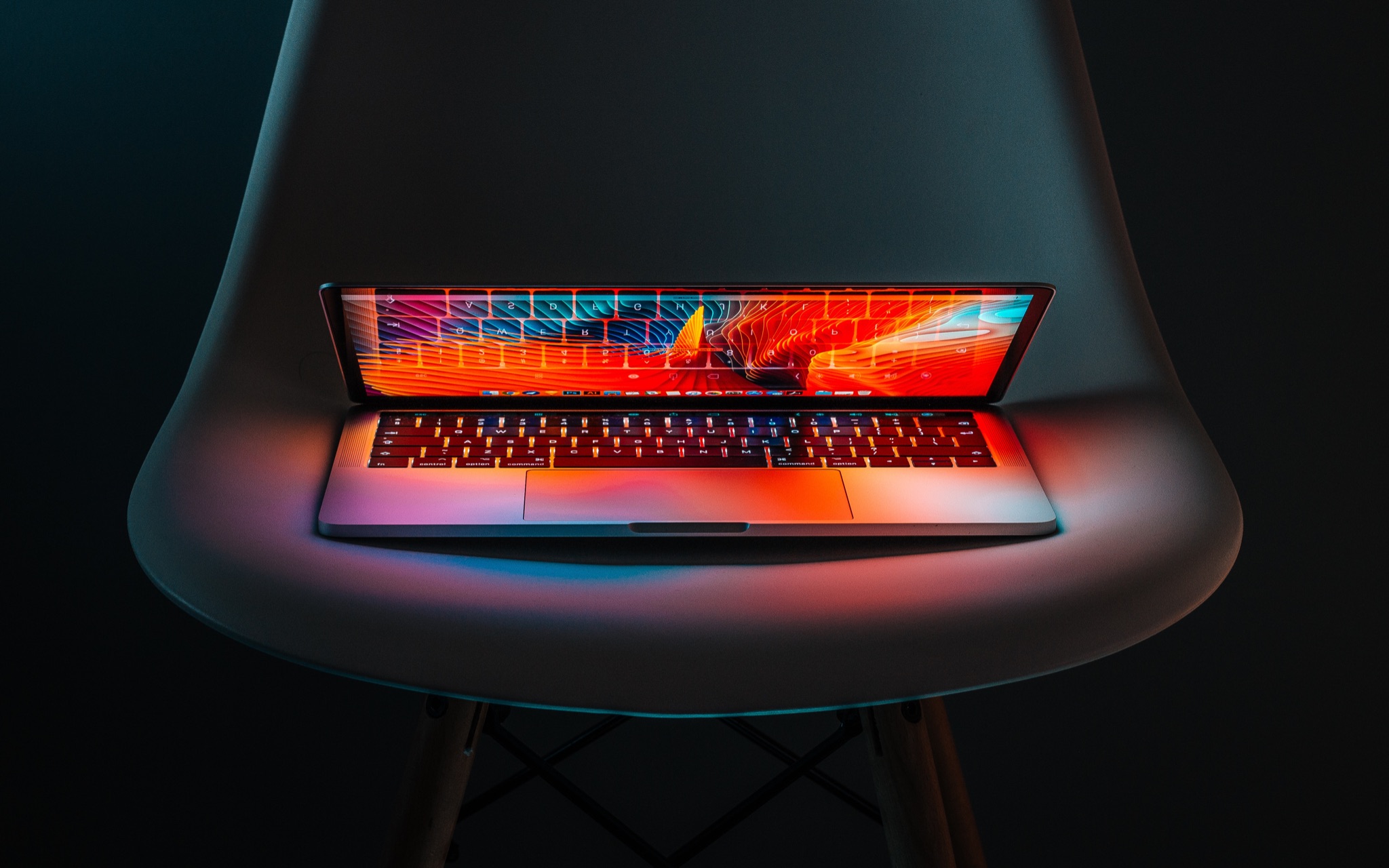
The rapid development of technology and the pandemic of 2020 have affected the behavior of users on the Internet. People have begun to spend more time online, in front of a laptop screen, or with a smartphone in their hands. Such a load influences their well-being – the eyes get tired of the constant glow. Therefore, the designers came up with a solution and introduced the ability to set a dark mode. Now users can surf the Internet even at night without experiencing discomfort. And as statistics show, about 30% of online purchases are made at night.
Engaging scrolling
Scrolling through an infinitely long page with a huge amount of information is boring. But now there is an opportunity to make this process exciting and interesting. While scrolling the site, some action occurs in the center of the screen: animation or video with sound. The designer literally creates a story that unfolds on the resource page. It is unlikely that anyone will be able to resist and close the site before the story comes to its logical conclusion.
Animated 3D elements
Colorful 3D graphics will hardly surprise anyone. But users still like the content of this format. Therefore, designers have decided to try to combine 3D technology and animation. Now the picture has become even more realistic. Elements of this type can now be found on some portals during the loading of the site. 3D objects are spinning while resource pages are being loaded. This allows visitors to reduce the waiting time and get entertained.
Geometry
This design is ideal for those companies that are not yet ready to introduce modern trends in the design of the site. Thanks to a variety of geometric shapes, the resource can look stylish, creative, and innovative. Depending on the color scheme, compositions with strict outlines can have completely different meanings. You can experiment with geometry for a very long time. Now it is an independent design element used to convey the atmosphere and brand concept, as well as to create accents.

Screen split
This trend involves dividing the page into two fields. Each part contains objects and design elements that are opposite in meaning and different in color and contrast. Content with this design looks good on any device. Designers use a split-screen to make it easier for the user to perceive content, manage the visitor’s attention and focus on important information. When a page is divided into two parts, one with an image and the other with text, the customer’s eye is focused on the information, even though the illustration should draw more attention.
Product as a design element
If the packaging of the product looks aesthetically pleasing and original, it can be used in the design of the page. This will kill two birds with one stone: the creation of an unusual design that is radically different from the design of competitors and grabbing the attention of visitors, thus increasing the awareness of the product. Most often, packaging as a design element is used to promote food products.
Website design trends are constantly changing and sometimes it is not possible to keep up with them. But the issues of style and page design are aimed, first of all, at increasing the potential of the resource. Therefore, one of the main tasks of the webmaster is still to provide comfort and convenience for visitors to the site. Meanwhile, following the trends will guarantee increased attention.


